


How the Dashboard Gets Its Colors

The Colors of the Dashboard
Part Three in a Series
The California School Dashboard, which debuted in early 2017, is the state's primary way of summarizing and communicating the "performance" of schools, districts, and groups of students. Some of the data on the dashboard is assembled through state data systems, and insiders call these "state" indicators. The dashboard also includes "local" indicators, which we explain in a different post.
Broadly, the state-managed indicators on the Dashboard represent two things: current results ("status") on student outcomes such as test scores; and progress or the lack of it ("change"). As mentioned in prior posts in this series, the California State Board of Education has established "cut points" for both status and change to define levels of performance.
How does that actually work?
The 5 by 5 Reference Chart
We'll take this step by step.
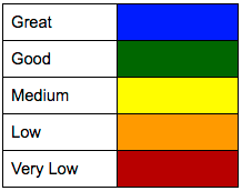
In order to assess a performance color, imagine that each indicator on the Dashboard begins by stacking the five levels of status vertically. Red (poor results, or "very low" status) goes on the bottom. Blue (great results, or "very high" status) stands on the top. The dividing lines between the colors are the Board's "cut points."
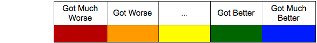
Each indicator also orders the five levels of change. Backward progress or weak progress goes on the left. Rapid improvement goes on the right.
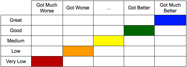
Combining the two (status and change) produces a five-by-five table. The performance colors on the diagonal are obvious: Great results and great improvement clearly call for cool blue in the upper right corner. Very low results that are getting much worse clearly call for a red alert in the lower left corner. Orange, yellow and green fall in line diagonally, like this:
Which performance color should be assigned to each of the other cells on the table? That's a matter of judgment. For each indicator, the California State Board of Education has defined a "5 by 5 reference chart." Generally, these charts look something like this:
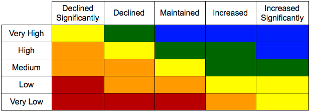
The horizontal lines in the table above represent cut points in status. The vertical ones represent cut points in change. There is a 5x5 color table for each of the state-defined indicators. In the following posts we explore these indicators and how you might want to use them.
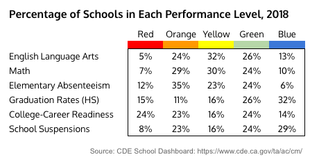
Although the boxes in the grid above appear to be the same size, it's worth knowing that some performance levels are more common than others. The distribution of colors varies significantly by indicator. For example, yellow is the most common performance level for the English and Mathematics indicators, but blue is the most common for high school graduation. The percentage of schools in each performance category for each indicator in the 2017-18 school year is summarized in the table below. This distribution is not fixed, and could improve.
In the top right hand corner of a school or district Dashboard you will see a purple button labeled "View Additional Reports." It takes you to a menu that enables you to see the 5x5 grids for all the state indicators. These grids also explain how each of the schools in a district or student subgroup in a school performed. The performance grids are almost always 5x5, but there are exceptions. For example, when the number of individuals involved is so small that privacy could be compromised, the state sometimes scrunches the grid to 3x5.
At the risk of being obvious, the dashboard is designed to support a system that is basically consistent from year to year. When there is a big change, the dashboard cannot calculate performance. For example in the 2018-19 school year it was not possible to determine performance colors for English proficiency because the underlying tests were changed from the CELDT to the ELPAC.
In-depth documentation of the California School Dashboard is available from the California Department of Education. The full documentation includes all the details.
Mary Perry and Carol Kocivar contributed to this post.
Updated March 19, 2017 to include analysis of the percentage of schools in each performance category.
Updated in December 2018 and January 2019.
Context: Ed100 Lesson 9.7
Part 1: Overview
Part 2: The Indicators
Part 3: Performance Colors
Part 4: Math and English
Part 5: English Learners
Part 6: Attendance and Absenteeism
Part 7: Suspensions
Part 8: Graduation
Part 9: College and Career Success
Part 10: "Local" Indicators for School Districts
Tags on this post
DashboardAll Tags
A-G requirements Absences Accountability Accreditation Achievement gap Administrators After school Algebra API Arts Assessment At-risk students Attendance Beacon links Bilingual education Bonds Brain Brown Act Budgets Bullying Burbank Business Career Carol Dweck Categorical funds Catholic schools Certification CHAMP Change Character Education Chart Charter schools Civics Class size CMOs Collective bargaining College Common core Community schools Contest Continuous Improvement Cost of education Counselors Creativity Crossword CSBA CTA Dashboard Data Dialogue District boundaries Districts Diversity Drawing DREAM Act Dyslexia EACH Early childhood Economic growth EdPrezi EdSource EdTech Education foundations Effort Election English learners Equity ESSA Ethnic studies Ethnic studies Evaluation rubric Expanded Learning Facilities Fake News Federal Federal policy Funding Gifted Grade inflation Graduation rates Grit Health Help Wanted History Home schools Homeless students Homework Hours of opportunity Humanities Independence Day Indignation Infrastructure Initiatives International Jargon Khan Academy Kindergarten LCAP LCFF Leaderboard Leadership Learning Litigation Lobbyists Local control Local funding Local governance Lottery Magnet schools Map Math Media Mental Health Mindfulness Mindset Motivation Myth Myths NAEP National comparisons NCLB Nutrition Pandemic Parcel taxes Parent Engagement Parent Leader Guide Parents peanut butter Pedagogy Pensions personalized Philanthropy PISA Planning Policy Politics population Poverty Preschool Prezi Private schools Prize Project-based learning Prop 13 Prop 98 Property taxes PTA Purpose of education puzzle Quality Race Rating Schools Reading Recruiting teachers Reform Religious education Religious schools Research Retaining teachers Rigor Rubrics School board School choice School Climate School Closures Science Serrano vs Priest Sex Ed Site Map Sleep Social-emotional learning Song Special ed Spending SPSA Standardized tests Standards Strike STRS Student motivation Student voice Success Suicide Summer Superintendent Suspensions Talent Taxes Teacher pay Teacher shortage Teachers Technology Technology in education Template Test scores Tests Time in school Time on task Trump Undocumented Unions Universal education Vaccination Values Vaping Video Volunteering Volunteers Vote Vouchers Winners Year in ReviewSharing is caring!
Password Reset
Search all lesson and blog content here.
Login with Email
We will send your Login Link to your email
address. Click on the link and you will be
logged into Ed100. No more passwords to
remember!


Questions & Comments
To comment or reply, please sign in .