


The California Dashboard for Suspensions

You're OUT!
Keeping control in a classroom is difficult, and when students misbehave or disrupt class, teachers and administrators need tools to respond. For generations, one of the tools of discipline in schools has been suspension: temporarily removing a misbehaving student from school.
Of course, suspensions aren't the only option. Ed100 Lesson 5.13 explores the broad topic of discipline in school, including alternatives to suspension. There is a growing consensus among educators that suspensions and expulsions do harm. Removing young people from the active learning environment may turn those students toward permanent school failure without making schools safer or more effective.
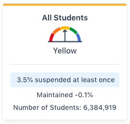
Responding to these findings, schools in California are gradually reducing the use of suspension in school discipline, especially for "willful defiance". The state of California is supporting this trend by using the California School Dashboard to shine light on the issue. Statewide, about 3.5% of the 6.4 million public school students in grades K-12 were suspended at least once during the 2017-18 school year — over 220,000 students.
It's common for students to be suspended more than once; in 2017-18 the total number of suspensions in the state was 363,000, about two-thirds higher than the number of individuals suspended. The California School Dashboard focuses attention on number of individual students rather than the number of suspensions.
Suspension rates vary significantly. For example, the average suspension rate for socioeconomically disadvantaged students in 2017-18 was 4.4%, more than double the rate for students not disadvantaged (2.0%). Foster youth were suspended at a high rate (15.2%), as were homeless students (5.6%). Suspension rates tend to be higher in rural areas. They also tend to vary quite a bit by race/ethnicity, as described below.
Suspension Rates by Race/Ethnicity, 2017-18 | ||
|---|---|---|
|
Group |
Group Size |
Suspension Rate |
|
Hispanic |
3,459,758 |
3.6% |
|
White |
1,478,216 |
3.0% |
|
Afr. American |
360,326 |
9.4% |
|
2+ races |
284,233 |
3.4% |
|
Asian |
584,002 |
1.0% |
|
Amer. Ind. |
33,808 |
7.2% |
|
Filipino |
154,530 |
1.3% |
|
Pacific Isl. |
30,046 |
4.7% |
|
All Students |
6,384,919 |
3.5% |
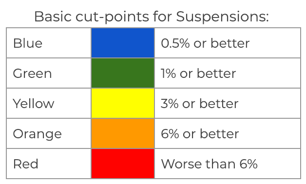
The Dashboard indicator for suspensions uses the following cut points. If suspension rates are stable — that is, not getting significantly better or worse than last year — these are the basic levels:
As with all indicators on the dashboard, the cut-points above aren't the end of the story because performance color is designed to reflect evidence of change. Where suspension rates are improving more than 0.3% year-on-year, the dashboard may assign a sunnier performance color. The reverse is also true. In the table below, the middle column is the same as the cut-points above. The columns to the right reflect an improving trend; those to the left reflect a worsening trend.
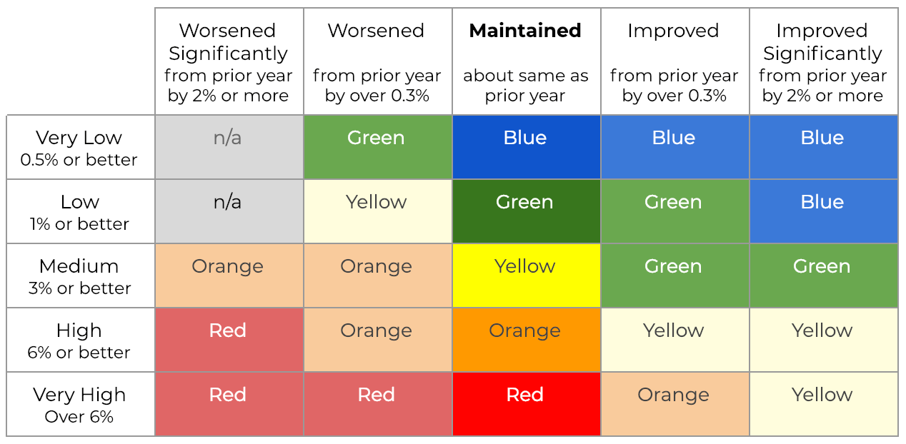
When the Dashboard is being applied to a small school (or a small subgroup) of fewer than 150 students, the outer columns are combined with the inner ones. By eliminating the nuance of by how much, this methodology avoids chopping up the data into groups too small to be displayed. In this "three-by-five methodology" the dashboard shows whether suspension rates got worse, stayed the same, or got better.
As always, the big idea behind the Dashboard is to focus attention where it is needed so that local leaders can use the data to improve.
How does your school compare? The Dashboard includes a feature called a "placement report," which lists schools or subgroups in the 5x5 grid above. This can be a helpful starting place for leaders of districts, counties and PTAs to begin a conversation. Identify schools around you that are improving, and perhaps you can learn from them. To find the placement report, look in the upper right corner of the Dashboard for the link to "additional reports." Using Dashboard data, EdSource has created a concise search-and-compare tool to make comparisons easier.
Context: Ed100 Lesson 9.7
Part 1: Overview
Part 2: The Indicators
Part 3: Performance Colors
Part 4: Math and English
Part 5: English Learners
Part 6: Attendance and Absenteeism
Part 7: Suspensions
Part 8: Graduation
Part 9: College and Career Success
Part 10: "Local" Indicators for School Districts
Tags on this post
Dashboard SuspensionsAll Tags
A-G requirements Absences Accountability Accreditation Achievement gap Administrators After school Algebra API Arts Assessment At-risk students Attendance Beacon links Bilingual education Bonds Brain Brown Act Budgets Bullying Burbank Business Career Carol Dweck Categorical funds Certification CHAMP Change Character Education Chart Charter schools Civics Class size CMOs Collective bargaining College Common core Community schools Contest Continuous Improvement Cost of education Counselors Creativity Crossword CSBA CTA Dashboard Data Dialogue District boundaries Districts Diversity Drawing DREAM Act Dyslexia EACH Early childhood Economic growth EdPrezi EdSource EdTech Effort Election English learners Equity ESSA Ethnic studies Ethnic studies Evaluation rubric Expanded Learning Facilities Fake News Federal Federal policy Funding Gifted Graduation rates Grit Health Help Wanted History Home schools Homeless students Homework Hours of opportunity Humanities Independence Day Indignation Infrastructure Initiatives International Jargon Khan Academy Kindergarten LCAP LCFF Leaderboard Leadership Learning Litigation Lobbyists Local control Local funding Local governance Lottery Magnet schools Map Math Media Mental Health Mindfulness Mindset Myth Myths NAEP National comparisons NCLB Nutrition Pandemic Parcel taxes Parent Engagement Parent Leader Guide Parents peanut butter Pedagogy Pensions personalized Philanthropy PISA Planning Policy Politics population Poverty Preschool Prezi Private schools Prize Project-based learning Prop 13 Prop 98 Property taxes PTA Purpose of education puzzle Quality Race Rating Schools Reading Recruiting teachers Reform Research Retaining teachers Rigor School board School choice School Climate School Closures Science Serrano vs Priest Sex Ed Site Map Sleep Social-emotional learning Song Special ed Spending SPSA Standards Strike STRS Student motivation Student voice Success Suicide Summer Superintendent Suspensions Talent Teacher pay Teacher shortage Teachers Technology Technology in education Template Test scores Tests Time in school Time on task Trump Undocumented Unions Universal education Vaccination Values Vaping Video Volunteering Volunteers Vote Vouchers Winners Year in ReviewSharing is caring!
Password Reset
Search all lesson and blog content here.
Login with Email
We will send your Login Link to your email
address. Click on the link and you will be
logged into Ed100. No more passwords to
remember!


Questions & Comments
To comment or reply, please sign in .
Gloria Lucioni January 29, 2019 at 5:26 pm